Interaction Design
Category
Sketch, ProtoPie
Tools
Year
2016
I'm a paragraph. Click here to add your own text and edit me. It’s easy. Just click “Edit Text” or double click me to add your own content and make changes to the font.
Onboard
Onboard is an exploration of flight booking and boarding experience design

Airlines these days are going for the self-service approach, replacing service counters with automated kiosks. Online check-ins have made the boarding process fast and convenient.
As many travellers use mobile platforms to complete their transactions, being able to provide organic, intuitive interactions between the user and interface make a big difference in user experience.


I'm a paragraph. Click here to add your own text and edit me.
Bits and Pieces -
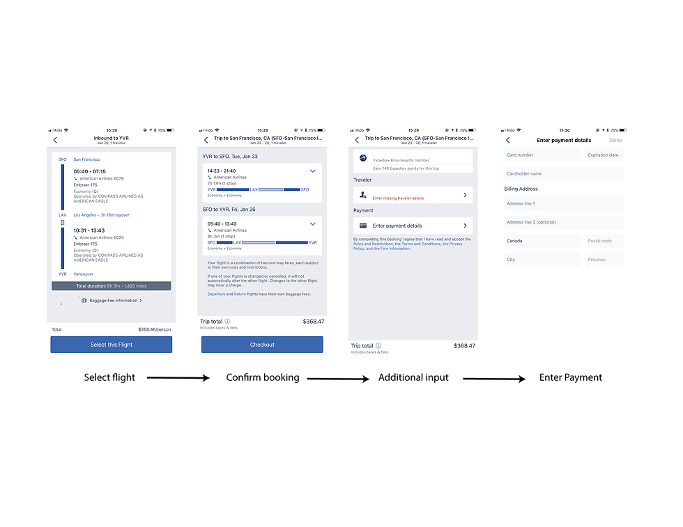
Scattered information
In many travel applications, when the user completes a flight search heading to finish the booking, it's usually a multiple-page process. Where flight detail on one page, payment options on the next page, order confirmation jumps the user to another page. When the booking process is complete, the user receives an email in the inbox. And when the traveller arrives at the airport, the person still needs to use an automated kiosk to have the boarding pass printed.
These series of steps require the user to switch between multiple individual applications. Each application uses a distinctive interface, the interaction that requires a learning curve to users in order to master the process, which could lead to confusion, frustration and human error.
Proposed Solution - Integrated Experience
To tackle the deficiency identified above, my solution is to simplify, integrate the booking process into intuitive interactions using Nielsen's heuristics rules.
"Visibility of system status"
"Flexibility and efficiency of use"
- Jakob Nielsen's 10 Usability Heuristics
First off, starting from the flight detail page, payment options appear on the same page with flight detail. Users can get a double-check before heading to payments, this way reduces the chance of confusion.

"Consistency and standards"
When the user has chosen the payment method, in this case, we use ApplePay as an example. Standard ApplePay interface appears from the bottom, providing a familiar interface that is consistent across all ApplePay-enabled applications.
By using a consistent payment interface that is widely used on all Apple products, users can complete action much faster, without wondering about the words, buttons and actions.
#Vertical Scroll, #Touch ID, #Vibration feedback

"Visibility of system status"
"Match between system and the real world"
"Aesthetic and minimalist design"
Alrighty! The user has now successfully booked their flight. What more can we do to speed up their journey?
Currently, booking confirmations are nothing more than an email that looks like something printed from a typewriter in the 1960s. And online check-in means users have to go somewhere else, entering the name, flight number, booking reference, again.
With all the information already available, why not generate the boarding pass so the user can have it right away?
On the final screen, on the top-left corner, "Ready to go" and "your flight is booked" are there to indicate the status of the process for the user, which helps users understand their booking is complete. The digital boarding pass mimics the printed boarding pass. When the user is at the airport, a simple scroll on the screen, the boarding pass will become fullscreen and ready for the scanner.

Reflections
Although travel is always exciting, planning a journey and keeping everything organized can be a big headache for some people. For an a-little-bit-OCD person like me, I always plan my trip down to hours, double-check, triple-check my flights, hotel reservations, make sure I have a plan B, or even plan C and D. Having to do all those things between multiple sites, master all kinds of payment portal, carry tons of paperwork is extremely painful.
As a trained designer, I always think, will there be a well-integrated, intuitive interaction that can save me from my OCD? Something that allows me to “book-and-go” in one place, scan the digital boarding pass and I will be on my way, simple as getting a cup of coffee at Starbucks.


